
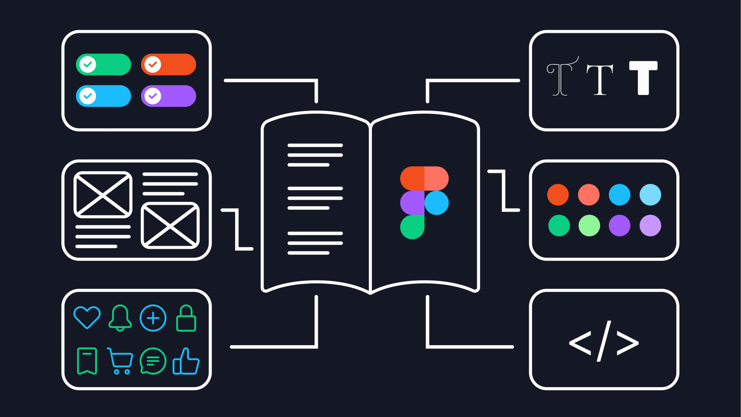
Beginning of Design
Design systems are the backbone of consistency, efficiency, and scalability in product design. They empower teams to work cohesively, ensuring that design decisions are not arbitrary but rather well-documented and repeatable. My journey with design systems has been multifaceted – I’ve worked with well-established ones, migrated a system from Sketch to Figma, and even built one from scratch (oh my). Each experience has provided valuable lessons about the complexity and importance of these systems in modern design workflows.
Before the Figma era, we used Sketch as our primary design tool for creating mockups and collaborating with engineers. It was the industry standard, and for a while, it served its purpose well. But when Figma started gaining traction, one of my mentors told me, “Forget about Sketch. Learn Figma now. It’s so awesome!” And so, I did. However, when I joined a new company, I quickly realized that not everyone had made the switch – everything they had was still in Sketch. We continued using it, but the transition to Figma was inevitable. When the time finally came to migrate, the process was overwhelming. Where do we start? How do we ensure a smooth transition without disrupting ongoing work? Transferring an entire design system and product library, with hundreds of screens, was no small feat. The process was far from easy, but step by step, we made it work. Despite the challenges, moving to Figma was one of the best decisions for efficiency, collaboration, and scalability. Eventually, we did it – and never looked back.
How We Did It: Step-by-Step Migration from Sketch to Figma
Migrating from Sketch to Figma was a challenge, but breaking it down into structured steps made it manageable. Here’s exactly how we approached the transition:
1. Start with the Design System Basics
Before migrating individual screens, we focused on the foundation—our design system. We started by setting up essential UI components, including:
- Buttons, text inputs, dropdowns, and other basic elements
- Typography scales and color styles (we created variables for component colors in Figma)
- Grid and spacing systems for layout consistency
By establishing these fundamentals early, we ensured that new screens could be built efficiently without constantly reinventing components.
2. Mock Up New Screens in Figma
Instead of migrating all existing screens at once, we designed new features directly in Figma. This approach allowed us to identify missing components as we worked. Whenever we encountered a missing element, we:
- Created a ticket for it in our backlog
- Built it properly into our Figma design system
- Ensured it was reusable and well-documented
This iterative process helped us expand our system naturally without overwhelming ourselves.
3. Keep Going – Break It Down into Smaller Steps
At times, the migration felt overwhelming—hundreds of screens, thousands of layers, and countless adjustments. The key was breaking everything into smaller, executable steps:
- Start with one section at a time (e.g., buttons, then forms, then modals)
- Focus on transferring only what’s actively needed first
- Don’t rush – prioritize quality over speed
This mindset helped us avoid burnout and ensured that each component was migrated with thoughtfulness and attention to detail.
4. Take Inspiration from Mature Design Systems
We didn’t want to reinvent the wheel. Instead, we studied well-established design systems like Primer (GitHub’s design system) to see how they structured their components. By inspecting their patterns, we:
- Understood best practices in scalability
- Improved our component flexibility
- Applied relevant insights to our own system
Analyzing mature design systems helped us level up our own designs instead of simply copying Sketch elements.
5. Use the Migration as an Opportunity to Improve
Since we were already putting in the effort to rebuild components, we took a step back and evaluated our existing styles. We asked ourselves:
- Do our components still serve us well?
- Are there inconsistencies we can fix?
- Should we modernize certain elements for better usability?
This was a perfect moment to refine our system, making it not just a transfer – but an upgrade.
Migrating from Sketch to Figma was tough, but by taking it step by step, using existing design systems for reference, and improving our components along the way, we turned a daunting task into a structured, productive transition. Once we fully moved over, we never looked back – the improved collaboration, efficiency, and scalability made it all worth it.
Navigating the Challenges of a Mature Design System
When working with a mature design system, you step into a structured environment where colors, typography, spacing, and components are already defined. Systems like Material Design or Carbon bring a sense of order, allowing designers to focus on solving user problems rather than reinventing UI elements from scratch.
However, the rigidity of established systems can be both a blessing and a challenge. While they provide consistency, they may also limit creativity. Finding the balance between adhering to guidelines and innovating within constraints is an essential skill for any designer working within an existing framework.
The Reality of Working on a Complex Product
At first glance, having a mature design system in place might seem like a perfect solution – everything is standardized, everything is reusable. But in reality, while working on a complex product like dotData (a tool for data scientists), things weren’t that smooth.
We often found ourselves needing unique components to better serve our users. The challenge? Engineers weren’t always happy about that.
“Why can’t you just use the existing components?” – this was a frequent question. And honestly, it’s a fair one. Ideally, we should be reusing what’s already built to maintain consistency and efficiency. But what if we want to introduce something new, trendy, or more user-friendly? What if existing components don’t fully address a particular business need or usability challenge?
The Balance Between Consistency and Innovation
This is where collaboration and conversation come in. Yes, we shouldn’t reinvent the wheel for every project, but it’s crucial to leave room for creativity and future improvements. The key is to:
- Leverage core components whenever possible to maintain consistency
- Advocate for necessary innovations when the user experience demands it
- Align with engineers to ensure new components are scalable and beneficial for long-term use
At the end of the day, business needs come first, and usability is key. The true art of working with a mature design system lies in knowing when to follow the rules and when to push the boundaries – while always keeping it simple and intuitive for the user.